
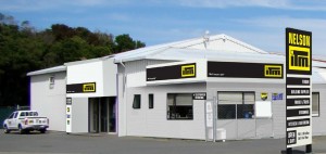
You’ve probably seen the fresh new look around town with the ITM brand.
The green and yellow colour scheme has been replaced with a striking black and yellow palette. We have designed a fresh, modern, contemporary look without losing our core identity. The new colour combination gives ITM a unique look in the market. Like all good things, this is taking time to implement over our stores and delivery fleet. Check out the new look underway for Havelock ITM!
What you can expect to see:
- Replacing the green in the ITM logo with black
- New look for exteriors and interiors, vehicles, marketing and collateral with common design cues that tie everything together
Our reasons for this change:
- The changes have been member driven to refresh of the branding, to have a more modern, contemporary look.
- We have had positive feedback with the logo developed for the ITM400, that this formed a key foundation for our change.
- Black is an easier colour to work with for branding (Green and yellow can make us look like Australian supporters!).
- The new colour combination gives ITM a unique look in the market
- It’s been more than 10 years since we updated our look.
Timing:
- Store changes will take place over the next 12 months with Nelson due to be painted next month.
More information on Nelson, Motueka, Takaka, Havelock and Greymouth ITM’s >>> click here.